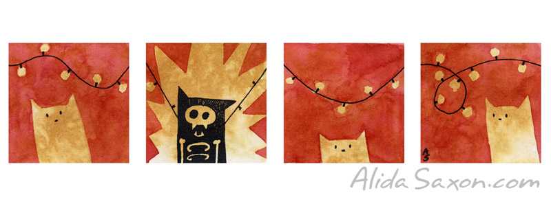
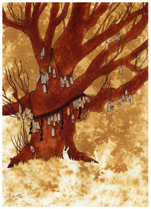
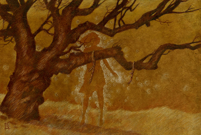
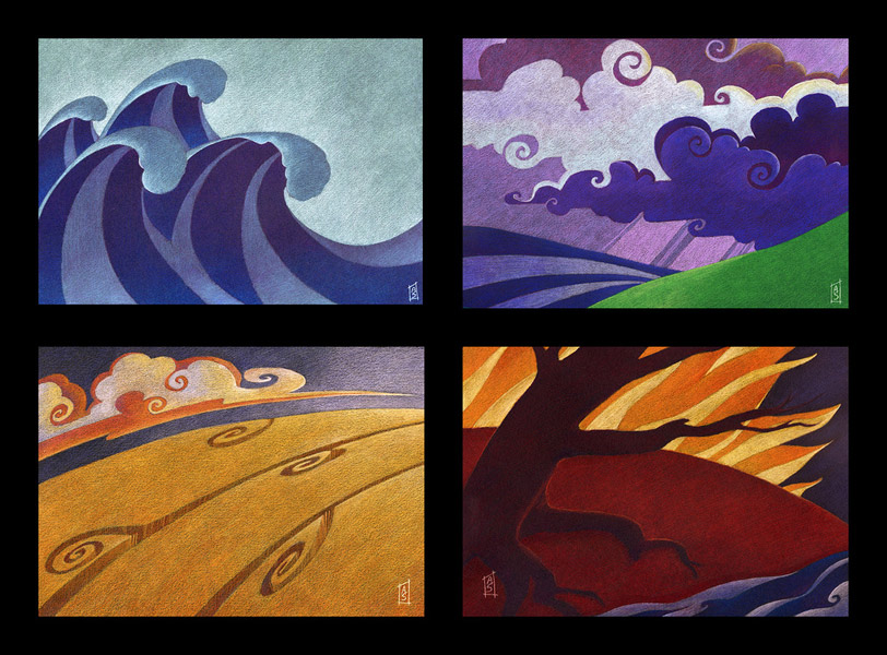
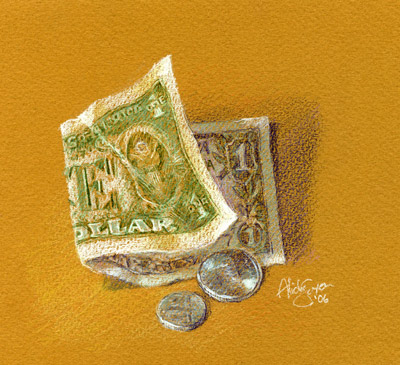
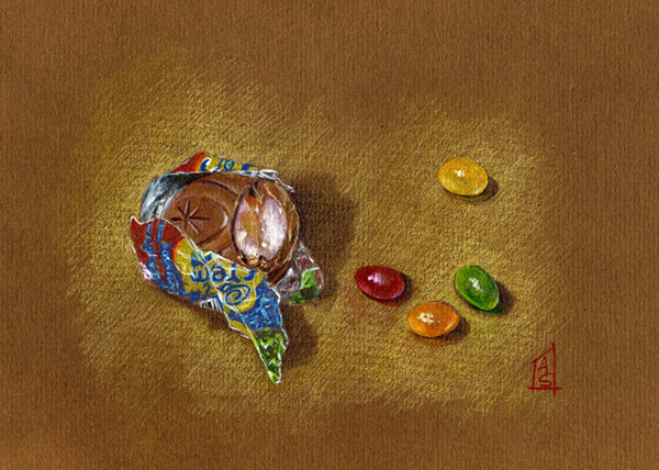
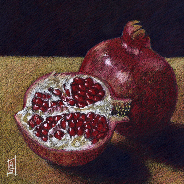
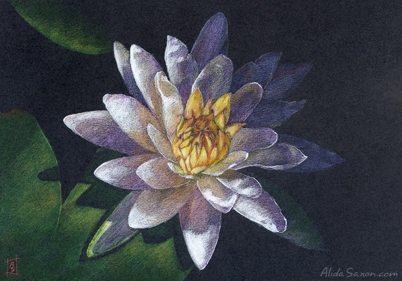
April 4th, 2010 by admin
Piece finished up with the same detail work as seen in the previous close up. Layers merged down and edges softened as needed. Any other pencil lines that needed to go scrubbed out. A complete flattening of the layers then and some adjustments to color and contrast as a whole. Piece sent by the AD for approval and done!
View Large
Posted in News | No Comments »
April 2nd, 2010 by admin
Sorry for the couple days quiet. I had to do some bookkeeping and other such admin which wouldn’t wait. Back to the work in progress.
Here on a new layer I’m establishing the light sources (warm, from the left, cooler from the right). I don’t want to get too shiny or he’ll look like he rolled off a car lot. It’d also be an image that just doesn’t gel with the frayed cloth that shows the wear of a long campaign. I’m saving the real brights for the edges of the armor, and his weapon.
View Large
You can see here the work on the metal. Laying in the brights from the various sky colors, as well as reflecting some of the dull colors off the rock, since any surface, especially a reflective one, is going to have a portion of the surrounding colors on display in its surface.
View Large
Posted in News | No Comments »
March 29th, 2010 by admin
Further along. I’m a bit annoyed that the screen capture is coming out badly. The colors aren’t true at all to my workspace. Anyone familiar with this issue?
Anyhow, you can see I’ve put the city in a fair bit, flat colors into the soldiers and scrubbed out another load of pencil lines. Next I need to put the big work on the focal point: the warlord. Going for dark steel, perhaps with golden accents, but we’ll see if that’s too pretty or not.
View Large
Posted in News | No Comments »
March 29th, 2010 by admin
Here you can see I’ve done a lot more with the sky, introducing some purples as well to keep it from being too monochromatic up there. Scrubbed out a lot of the pencil work into those spaces to blend in with the painting.
After that, new layer I’ve started on the cloth. It’s nice being able to isolate the elements this way so should I come to not like something, I can just delete the layer. You can see all the reds I’ve been mixing on the palette. For those who use painter, I use the Wet Oily Blender Brush a LOT. Almost exclusively. It’s got a short stroke to it, and with continued pressure the paint "runs out" so I can soften edges, or blend colors. If I need some blending without adding more color, I switch to one of the blender brushes.
View Large
Posted in News | No Comments »
March 28th, 2010 by admin
View Large
I haven’t done a work in progress set in a while, so here you go.
The pencils aren’t mine. This is a job where I’m doing the painting from someone else’s design work. This pencil illustration is by Jason Engle ( www.jaestudio.com/ ), the cover for a project at savage mojo (http://www.savagemojo.com/tiki-index.php)
To start, I created my layers in Photoshop, and made the top layer a copy of the pencil illustration set to "multiply", toned red. This Multiply setting is transparent, so it lets me paint under the linework while still seeing the linework. I tone it red since I’ll be scuffing the lines into the illustration at a later point, and I don’t want to muddy the colors with black.
View Large
Next, I got to working on the background first. This sets the whole tone for the piece, and since the atmosphere is a big deal to this illustration, it becomes even more important. Everything is very rough at this stage, and in the middle values. You can see how the multiplied layer keeps it easy to see what I’m doing, and I what I need to do in the future.
More soon. Honestly! I know I haven’t been around much, but I’ve been super busy, some of it under NDA contract, some of it just not arty or interesting. With any luck, more things worth posting from here out.
Tags: cover, digital, illustration, painter, savage mojo, wip
Posted in News, Work In Progress | No Comments »
December 24th, 2009 by admin
I hope you’re all having a good year’s end however you may celebrate. 
Posted in News | No Comments »
October 20th, 2009 by admin
I am not dead, or slacking. Just under an NDA contract and swamped for work for the next month.
In the meantime, have a cute carrot!
Posted in News | No Comments »
October 13th, 2009 by admin
This here is a poster I worked on for very soon to be playing live radio program at the Somerville Theater. A lot of fun to work on this poster, trying to get a bit of a vintage feel (but without adding aged grunge). This is the full poster version but there’s also a postcard version, buttons, etc. If you’re in the Boston area at the end of October, you might want to check it out!
Here’s the official website. And below you can see the theater (with poster in the coming attractions window!). Neil Marsh took the photo and kindly allowed me to post it with the poster.
Tags: illustration, poster, Vector
Posted in News | No Comments »
October 1st, 2009 by admin
Sorry to be out of touch for a few days. I was a bit ill since the weekend, and got very little done. Now I’m back at work and starting a piece I’ve had on the table for a long time, neglected. You can see the thumbnail concept sketch below.

This is a simple sepia ink line drawing to start, on some of my tea stained paper. I’m going to do a water color wash after this, and then decide what direction I am going to go from there. Right now I’m considering developing it both with traditional media and digital over traditional for a mixed media effect, to see which end result I like the best.
Tags: art, dryad, illustration, ink, painting, sepia, teapaper, three, trees, watercolor paper, wip, women
Posted in Work In Progress | No Comments »
September 27th, 2009 by admin
12″x8″ Blueberries
Study painted in Painter X
Tags: blueberries, garden, painter X, study, X
Posted in Paintings, Still life & Studies | No Comments »